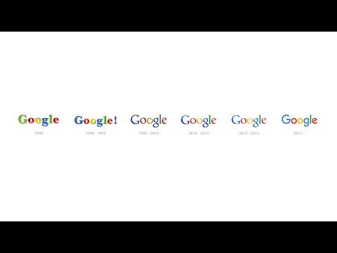
Google has a new logo. The new Google is showing off a new identity. The iconic four colors and “Google” over a white background remains unchanged, but the font is significantly different, removing the serifs that have been part of the letters for years. All in all, it’s a flatter, slightly more modern design — one that also evokes the company’s new Alphabet logo — but it’ll certainly take some getting used to.

Google describes the change as:
Today we’re introducing a new logo and identity family that reflects this reality and shows you when the Google magic is working for you, even on the tiniest screens. As you’ll see, we’ve taken the Google logo and branding, which were originally built for a single desktop browser page, and updated them for a world of seamless computing across an endless number of devices and different kinds of inputs (such as tap, type and talk).
It doesn’t simply tell you that you’re using Google, but also shows you how Google is working for you. For example, new elements like a colorful Google mic help you identify and interact with Google whether you’re talking, tapping or typing. Meanwhile, we’re bidding adieu to the little blue “g” icon and replacing it with a four-color “G” that matches the logo.
Here is a video on Google Evolved
So how is Google new logo? Do let us know in the comment box below. Stay tuned to AlltechBuzz for more updates.
